PayNet mobile app was initially developed to empower users to manage their personal information within the telecommunications sector. When I joined the project in 2018, the app served as a platform for telecom providers to offer personalized solutions, aiming to enhance user satisfaction and efficiency.
Recently, I chose to revisit the billing and payment process, an area I had previously contributed, to not only to enhance usability and efficiency but also to reframe my past experience through the lens of my current expertise. This redesign allowed me to integrate new knowledge in user experience, apply the latest trends in interface design, and demonstrate how evolving skills can drive continuous improvement.
PayNet was conceived as a mobile application for user account management in the telecommunications sector. Openet, a leader in back-end systems for major telecom companies, identified an opportunity to provide end users with direct access to their data, thereby enhancing the value of their services.
The primary goal of PayNet was to enable telecom providers to offer personalized account management solutions, addressing the growing demand for user-centric tools. Openet prioritized adaptability, ensuring the app could integrate seamlessly with diverse branding requirements and evolving market demands.
User experience / User interface designer in a team of three. Responsible for improving the payment user flow of the mobile application.
The app was successfully implemented across multiple client accounts, serving as a cornerstone of Openet’s service offerings. This initial success highlighted the potential of user-centered design to transform technical capabilities into engaging user experiences.
The billing and payment flow was a key component I had worked on during the original project. Revisiting this feature allowed me to integrate new insights and methodologies, reflecting my growth as a designer. Through this update, I aimed to:
This initiative also demonstrated my ability to independently lead continuous improvement efforts while leveraging prior experience in interdisciplinary teams.
The original billing and payment interface, while functional, included workflows that could be optimized to meet modern usability standards. My redesign focused on simplifying these processes to:
The billing and payments process in Openet's PayNet mobile application was selected for a redesign to align with current usability standards and provide a more intuitive experience.
The previous interface, while functional, presented workflows that could be optimized to improve efficiency in managing financial data.
The updated design aims to streamline navigation and simplify billing tasks.
To ensure a structured and user-centered redesign, I adopted Jesse James Garrett’s Elements of User Experience framework:

To achieve the redesign goals, I implemented a multi-faceted strategy:
I mapped the user journey for completing payments, uncovering key bottlenecks and inefficiencies that informed the redesign. A heuristic evaluation of the billing and payment flow revealed the following insights:
The flow does not clearly communicate the status of actions such as completed or pending payments.
Improvement Idea: Add clear visual confirmations, such as success messages and icons indicating pending or completed payments.
The visual hierarchy is unclear; key elements, such as action buttons, do not stand out enough.
Improvement Idea:
Use more specific labels like Payment History or Transaction Details, and redesign text to better align with everyday user language.
Navigation between screens is limited, with no easy way to go back or explore different options within the flow.
Improvement Idea:
Add visible and clear back navigation options. Incorporate tab navigation for sections such as Billing and History to allow easier movement within the app.
Visual inconsistencies in buttons, spacing, and styles across screens affect overall coherence.
Improvement Idea: Establish a unified design system covering colors, typography, and sizing to ensure visual consistency across the app.
Real-time validations for payment forms are missing, which may lead to user frustration and preventable errors.
Improvement Idea:
Implement dynamic input validations (e.g., card numbers, empty fields) to provide immediate feedback and reduce mistakes.
The visual hierarchy is unclear; key elements, such as action buttons, do not stand out enough.
Improvement Idea:
Redesign the interface using size, color, and contrast to prioritize critical information. Simplify secondary elements to reduce distractions and improve focus.
There is no accessible help section within the payment flow.
Improvement Idea: Add an easily accessible help option on critical screens, including FAQs or contextual tips to assist users.
When errors occur (e.g., failed payments), users are not provided with actionable next steps.
Improvement Idea:
Display specific error messages along with clear suggestions for resolution.
Users must rely on memory to recall payment details and prior actions.
Improvement Idea:
Display saved payment methods and surface relevant information when needed. Use pre-selected options for commonly used actions to reduce cognitive load.
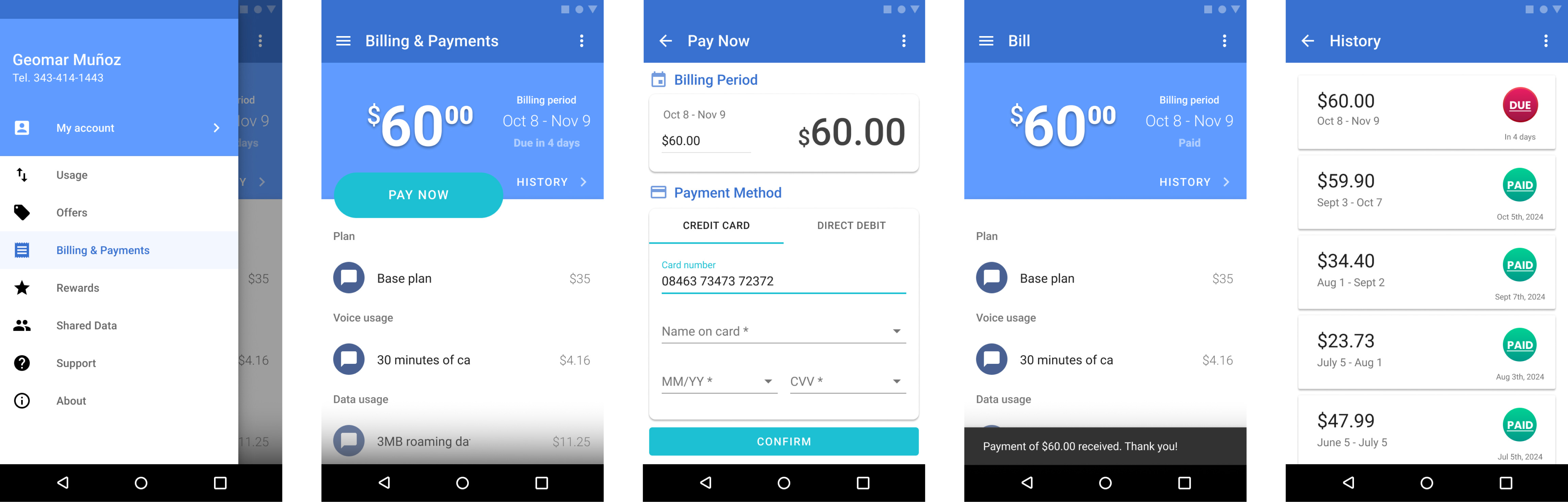
To understand industry standards, I benchmarked the billing and payment flows of key competitors, including Vodafone, Three Ireland, and EE. Key insights included:
These findings informed the redesign, ensuring that PayNet aligned with—and in some areas, exceeded—current user expectations.
I conducted quick usability tests with 20 participants in public spaces to gather diverse feedback on the original billing and payment flow. This guerrilla testing approach provided actionable insights and revealed key usability issues:
of participants (4 out of 20) were unable to complete the payment task without assistance.
(13 out of 20) expressed confusion about what steps to take after reviewing the billing summary.
(12 out of 20) had difficulty intuitively locating their payment history.
(14 out of 20) said they did not trust the security of the existing payment process.
(17 out of 20) found the visual interface outdated and unclear.
During the scope phase of the PayNet mobile application redesign, I translated strategic objectives and research findings into a comprehensive set of actionable requirements. This foundational step was essential for defining the features and functionalities needed to effectively redesign the billing and payment module.
By addressing user pain points and enhancing both the user experience (UX) and user interface (UI), the scoped requirements ensured the project stayed focused on delivering a solution aligned with user needs and business goals.
Through the definition of detailed functional and non-functional requirements, the application of UX/UI principles, and adherence to project constraints, I established a clear path toward a user-centered solution. This approach aimed to improve usability, efficiency, and overall user satisfaction—laying the groundwork for measurable improvements to the platform.
The application provided users with a clear, detailed breakdown of invoices, displaying essential information such as billing dates, amounts, and contracted services.
A payment history feature enabled users to review past transactions and download confirmations for their records. Throughout the payment process, the app included helpful guides and security recommendations to protect users’ financial information.
Automatic alerts kept users informed about pending invoices and upcoming due dates, fostering a sense of control and supporting efficient financial management.
The redesign project faced notable resource constraints, particularly related to timeline. To ensure feasibility, I prioritized core functionalities that addressed the most critical user needs.
Certain advanced features were excluded from this development phase, including cryptocurrency payments, integration with external digital wallets (e.g., Apple Pay, Google Pay), and other alternative payment methods. Implementing these capabilities would have required significant additional resources.
This phased approach enabled the project to focus on delivering a robust, user-friendly MVP while laying a scalable foundation for future enhancements.
In the initial redesign phase, I developed a Minimum Viable Product (MVP) focused on delivering essential functionalities:
To prioritize these features, I applied the MoSCoW method, helping to clearly distinguish between must-have, should-have, could-have, and won’t-have (for now) features.
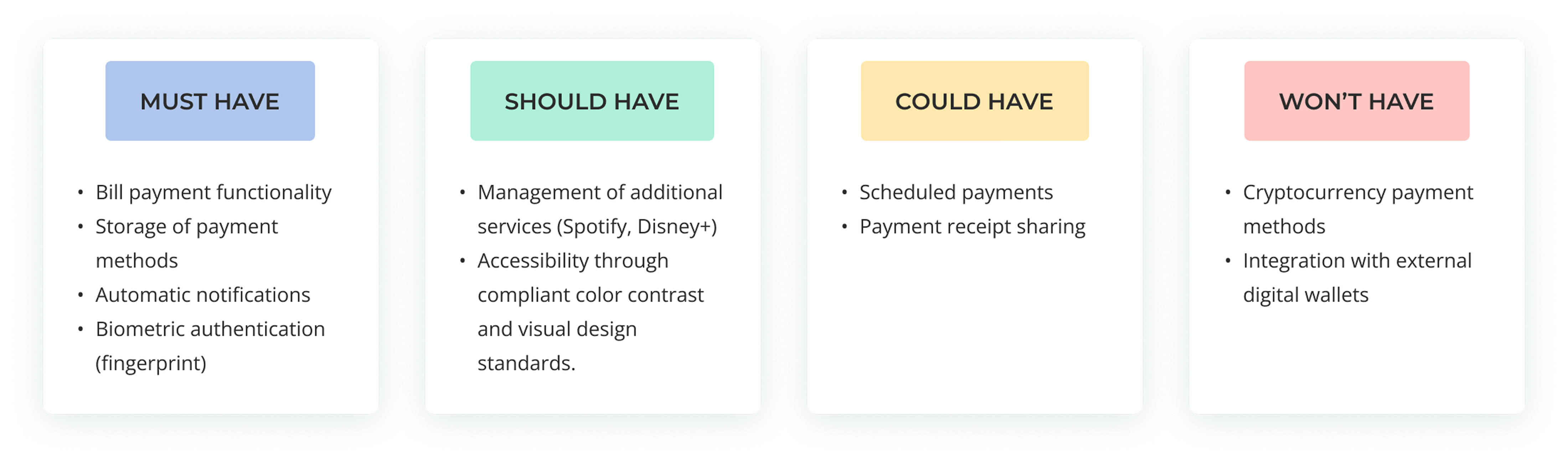
Future phases will focus on scalability and innovation, including the introduction of new payment methods and the integration of AI-driven real-time assistance. This strategic approach balances current resource limitations with the need to meet evolving user expectations and keep pace with technological advancements.
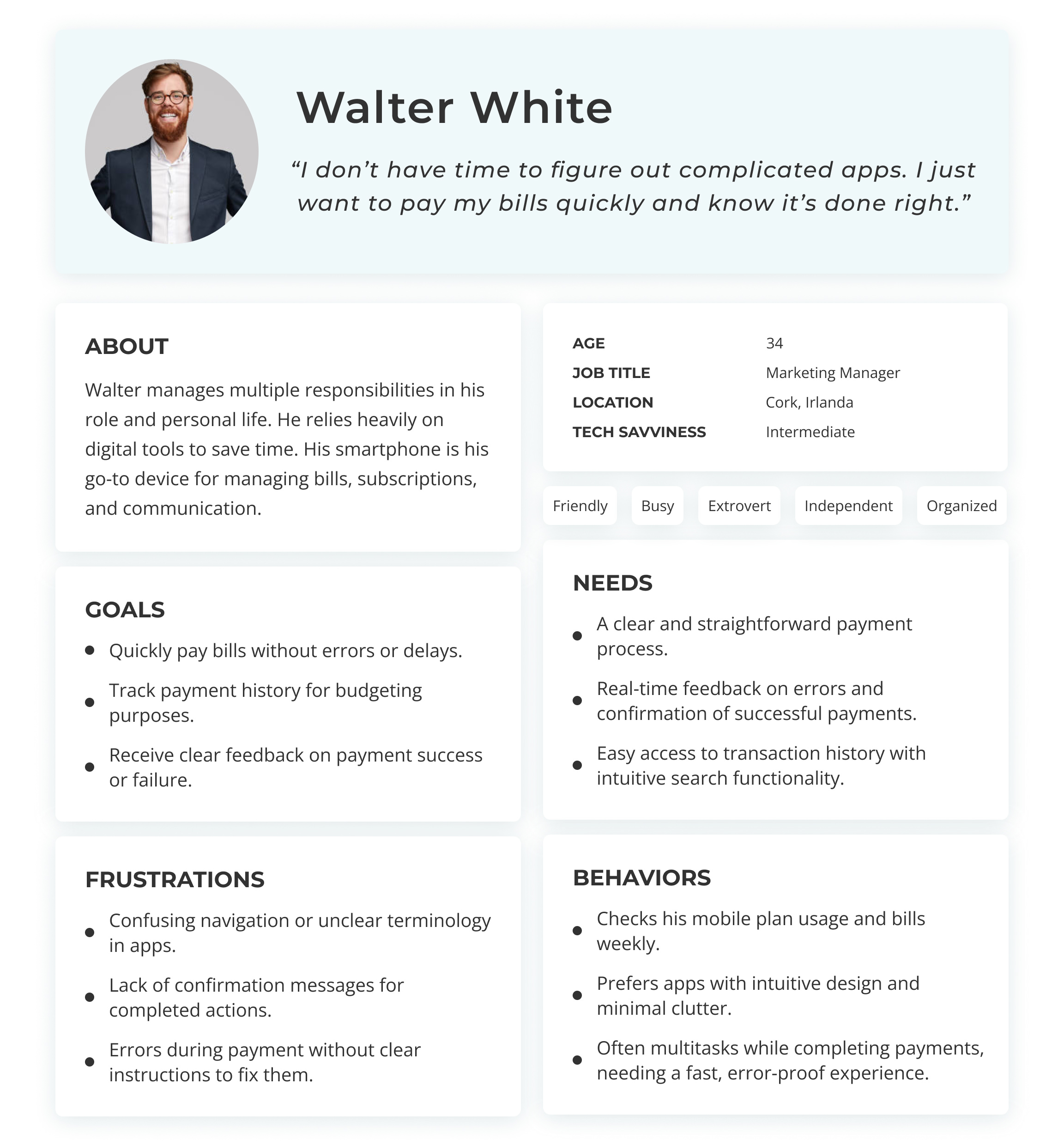
User stories were central to my Agile development process, ensuring that the PayNet app redesign effectively addressed the needs of its target audience. These stories focused on streamlining billing and payment workflows.
Key insights from the User Persona and Journey Map revealed:
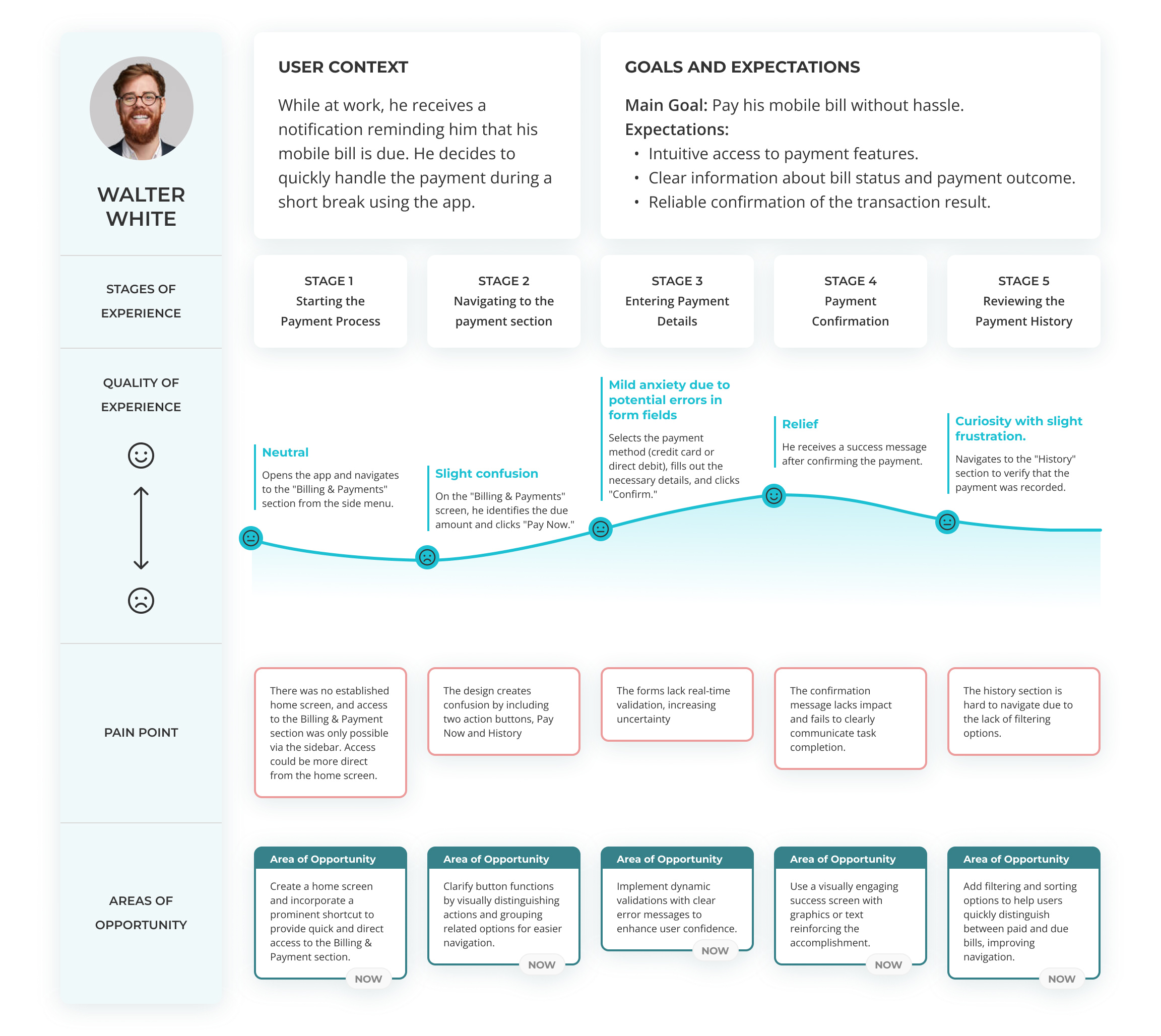
The original app featured fragmented workflows and lacked a centralized entry point, requiring users to navigate multiple sections to access core functionalities such as billing and payments. This design increased cognitive load, introduced inefficiencies, and contributed to user frustration.
The redesign aimed to:
By addressing these challenges, the redesign aimed to deliver a more coherent, user-centered experience, reducing friction and empowering users to manage their accounts with ease.
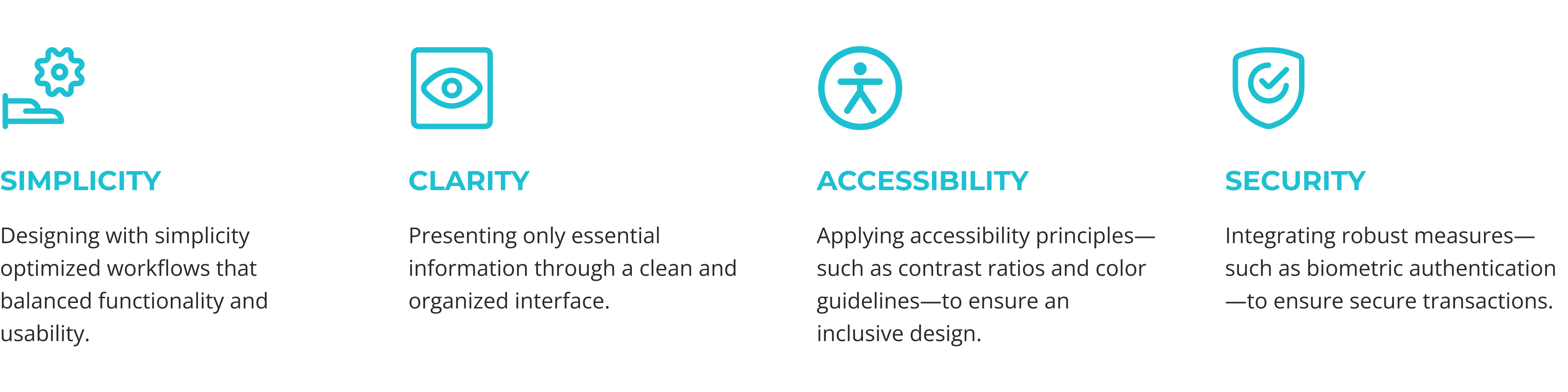
The redesign adhered to four core principles to ensure an optimal user experience.
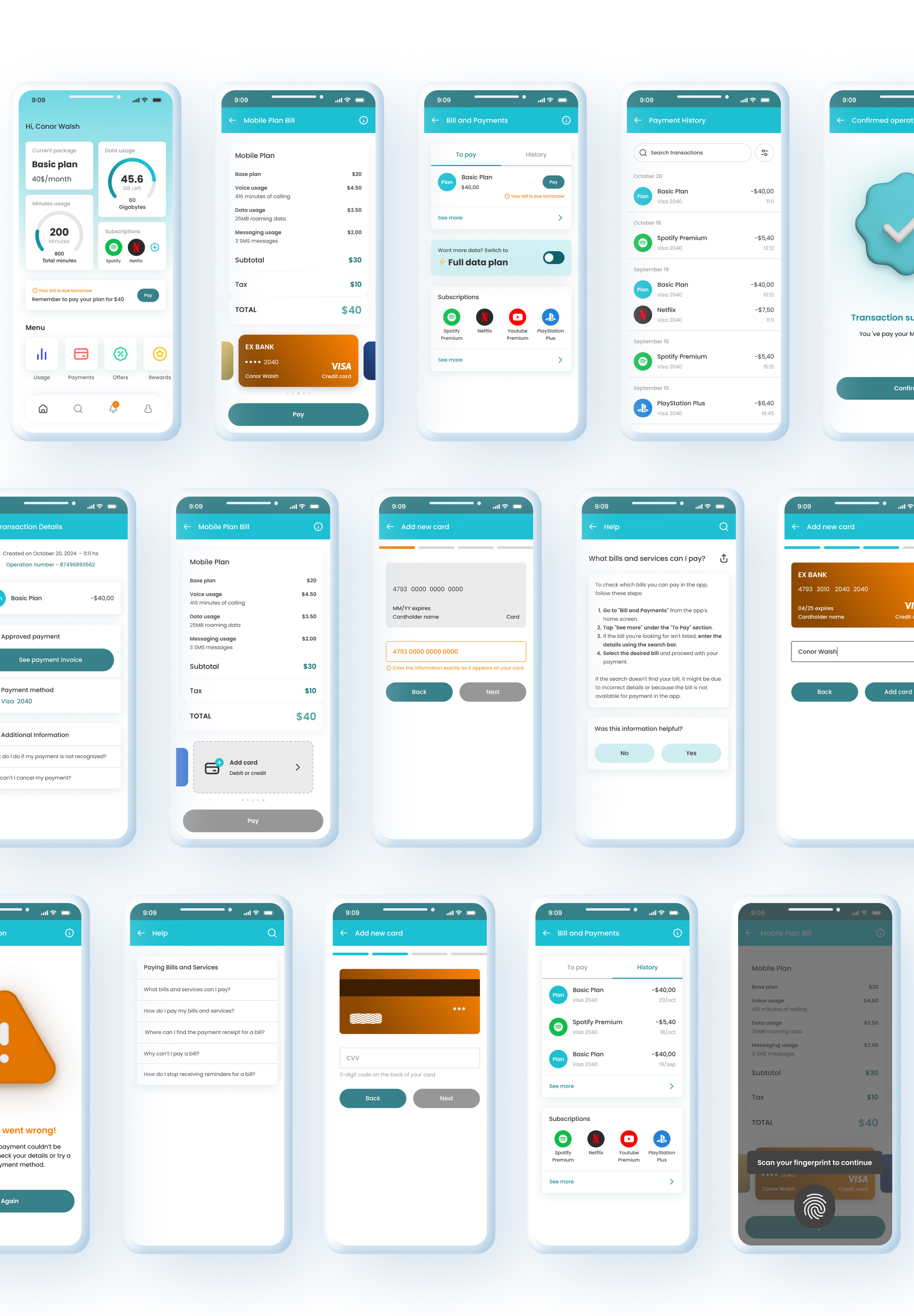
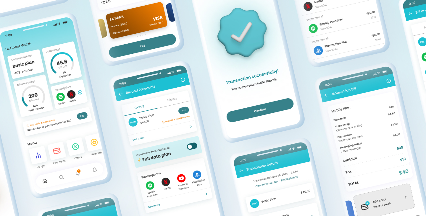
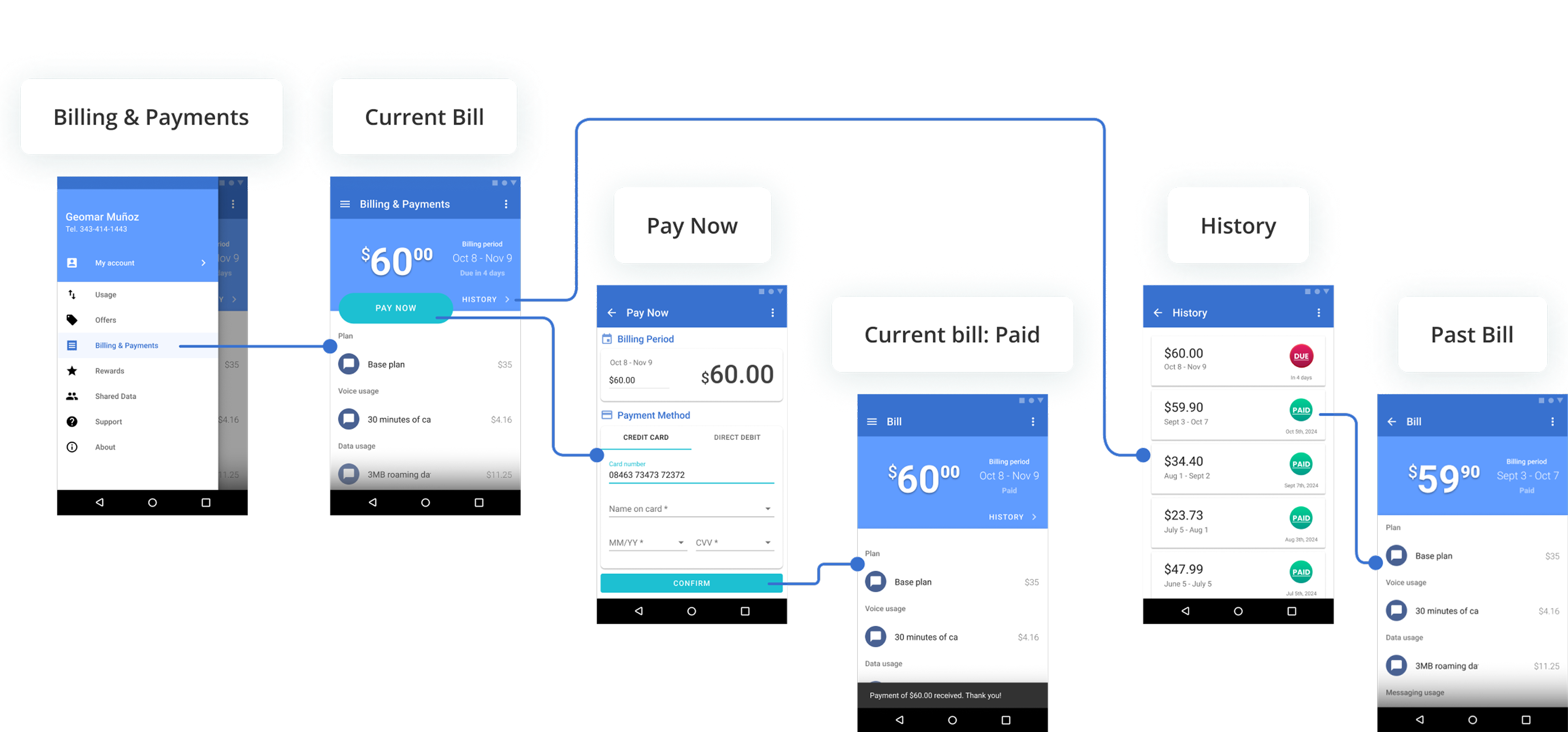
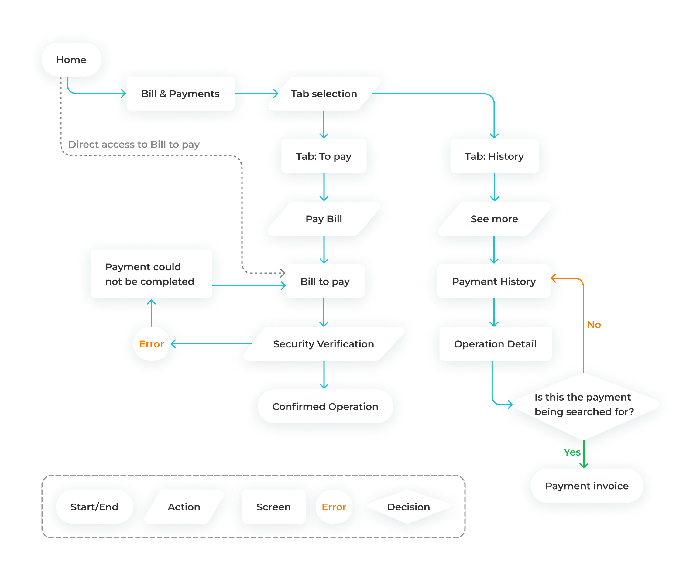
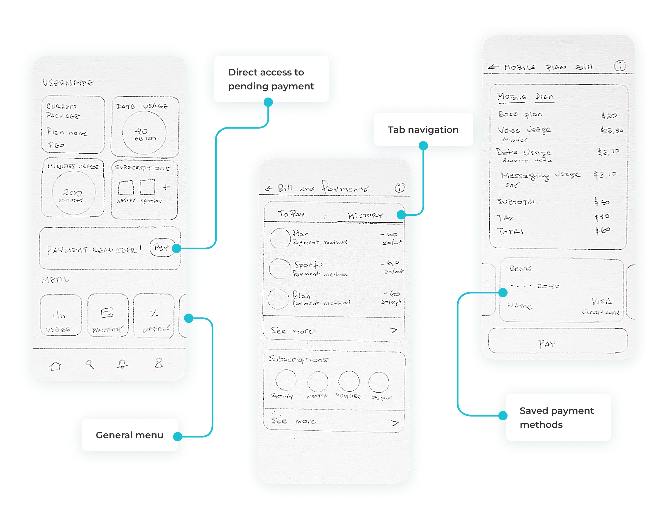
The updated user flow represents a significant improvement in usability, beginning with the introduction of a Home screen as the default entry point. Previously, users were directed to specific tabs, such as Usage, and had to rely on a lateral menu to access Billing & Payments.
The redesign establishes a centralized Home screen that consolidates key functionalities and includes a prominent shortcut for outstanding bill payments, enabling quicker and more intuitive navigation. A key enhancement to the user flow is the integration of both pre-saved payment methods and the option to add a new card directly within the bill payment interface.
Users can effortlessly select from saved cards or enter new payment details, including:
Input fields include real-time validation, with dynamic error messages displayed within the relevant fields, helping users identify and correct issues immediately, reducing friction and frustration.
Each step in the redesigned flow has been carefully optimized to ensure that tasks such as selecting invoices, choosing a payment method, and confirming transactions are seamless and efficient. Features like real-time feedback, confirmation messages, and context-aware error alerts enhance user confidence and reduce the likelihood of errors, ultimately increasing satisfaction and trust in the application.
This phase focused on establishing the app’s structural layout and navigation, creating a logical foundation to guide users seamlessly through their tasks. The redesign prioritized a user-centered framework, ensuring that core functionalities were clear, accessible, and easy to interact with.
The updated structure aligns with modern design standards and user expectations, serving as a blueprint for a cohesive, intuitive interface that enhances the overall user experience.
The high-fidelity design phase defined the app’s visual identity through:
Adhering to an 8-point grid system ensured precise alignment, consistent spacing, and a clean, organized layout. This approach elevated both usability and visual appeal.
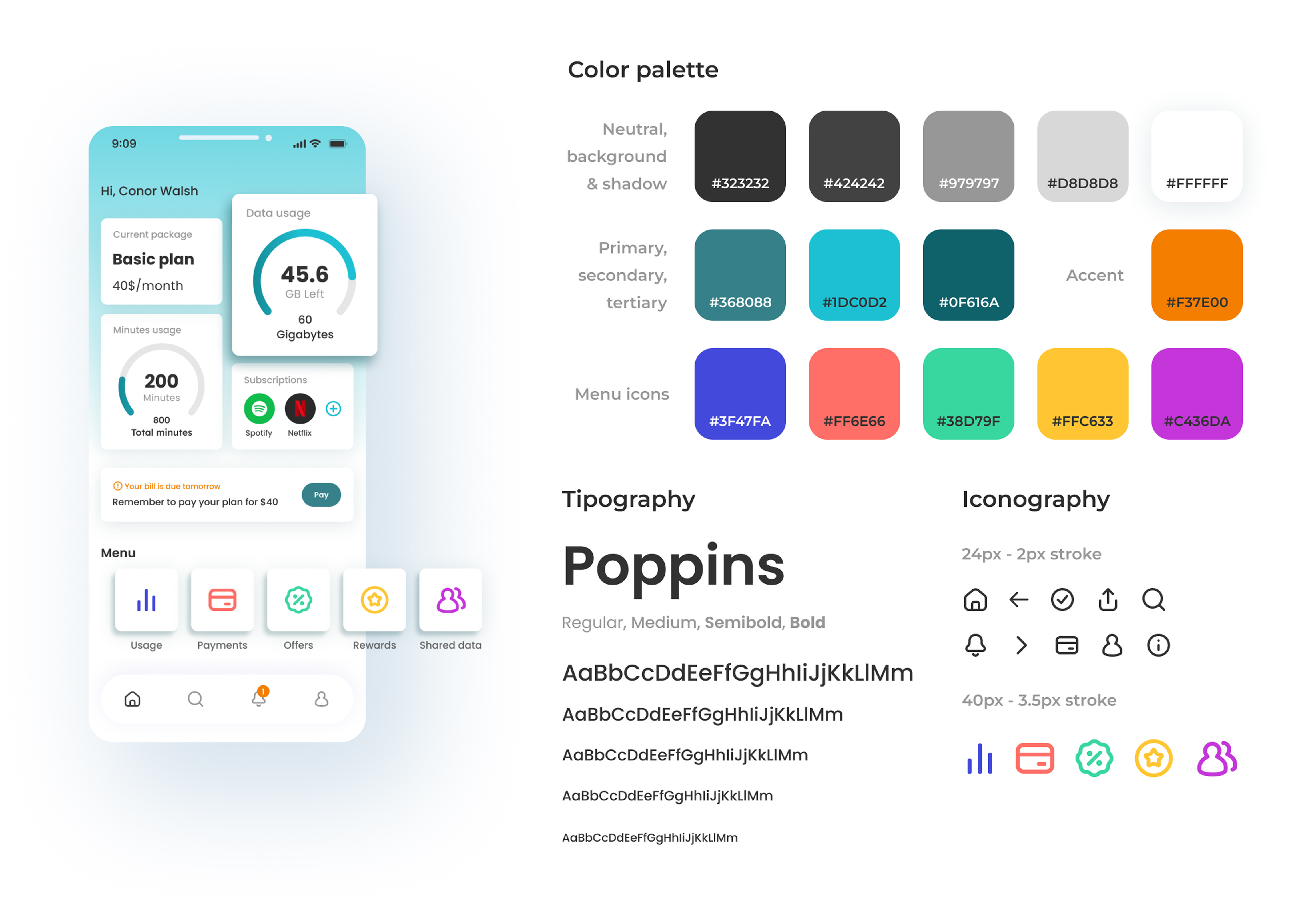
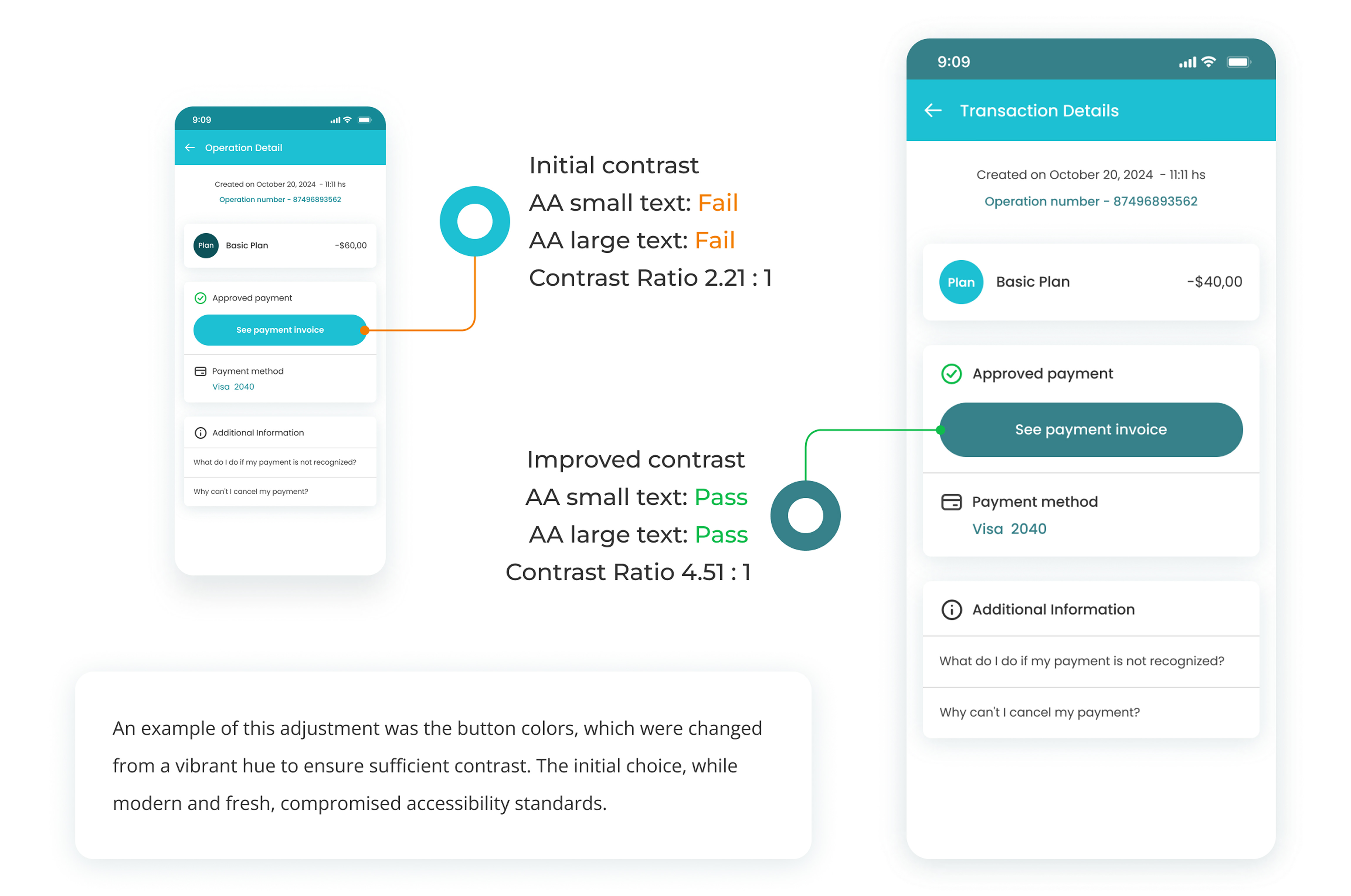
The design underwent a thorough accessibility review to ensure compliance with WCAG AA standards. Adjustments to color contrast and other key elements improved readability and inclusivity, without compromising the app’s visual identity.
The redesign emphasized the importance of aligning workflows with user needs and modernizing the interface to meet contemporary standards and expectations. Key insights and future opportunities include:
These updates highlight the transformative power of thoughtful design in creating an intuitive, efficient, and future-ready app experience, positioning the platform as a competitive digital solution.
Redesigning a project I had worked on years ago was a unique experience that allowed me to witness the evolution of both my skills and the industry as a whole. Initially, the idea of redesigning a previous project made me feel uncertain, as the solutions I had once proposed no longer seemed to meet current needs.
However, the experience turned out to be incredibly enriching, as I was able to integrate everything I had learned over time and bring a fresh perspective to the redesign. The most valuable takeaway was realizing how much my design knowledge has matured. As I revisited the original app flow, I understood that user experience is not static, it must continually adapt to technological advances and evolving user expectations.
Through this process, I learned the importance of revisiting past work with a critical eye: appreciating what was accomplished at the time while recognizing opportunities for improvement. Additionally, working on this redesign deepened my understanding of iteration. Over the years, my design approaches have become more thoughtful and methodical, focusing not only on what the design should look like, but also on how it can better meet user needs. Redesigning an existing workflow taught me to be more flexible and patient with processes, recognizing that effective solutions often require time to evolve.
This project reaffirmed my belief that design is an ongoing process of learning and adaptation, where each revision not only improves the product but also the designer. By retracing my steps, I was able to clearly see how much I’ve grown and how I can continue applying these insights to future projects.